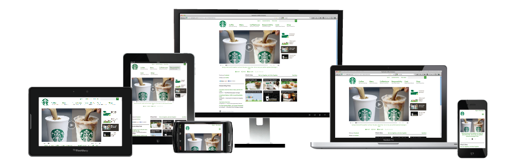
What is Responsive Website Design and Mobile Compatibility?
Responsive design is a way of building websites that gives the optimal user experience in different environments like tablets, mobile phones, desktops and even TV's. There are so many different size screens and often with small screens like mobile phones it's very difficult to find your way around a website, so with a responsive design the process is much more user friendly as the content of your website will respond to the devise on which it is being rendered.
What is the difference between a responsive web design and a separate mobile website?
A responsive website is one website that responds to all different sized devises but a separate mobile website is a new website altogether built only for a mobile devise. The problem with a separate mobile website is that you have 2 websites that you need to keep updated and also having two websites with similar content is not very good for search engine optimization.
Responsive web design is an evolution really of a mobile website. It's been named 'future friendly' and it really is the future of web design simply because of the unbelievable boom of browsing online on your phone.
Who knows what type of devise will be next but with a responsive website you need not worry.
How does a Desktop, Tablet and Mobile Compatible Website work?
A responsive design website is built using a flexible layout and Media Queries to set different breakpoints (so a different width will be set for mobile devises, tablets and desktops). What will happen is the images will scale down and the content will shift as the screen size gets smaller or larger but in all screens the text will be readable (unlike on your mobile with a normal website where you need to zoom into the page and scroll around to actually read the content).
How can Responsive Website Design Benefit my Business?
- With a responsive web design, your website is mobile compatible and it is much easier to read content on Smart-phones like an iPhone, Blackberry, Nokia and Android. There is no annoying left and right scrolling and no zooming needed.
- You're getting 3 websites in 1 - desktop, tablet and mobile website.
- Customers will enjoy being on your mobile compatible or tablet compatible website increasing the likelihood of them returning and sharing your website with their friends and colleagues increasing your conversion rates.
- Responsive design is a relatively new way of building websites and really is the future in web design so you will have an advantage over your competitors for a more user friendly website for all devices.
Since 2009, the rate of mobile Internet use has doubled every year and it isn't going to plateau anytime soon. How easy is it to Google contact information when you're on the move or read an interesting article when you're waiting for an appointment. With responsive design you just scroll down. Simple! Having contact details that are easily accessible - perfect! The easier your website is the navigate the more enjoyable your users experience will be.
Great job! They resolved my Highcharts issues very quickly. Will definately use again. Erik